
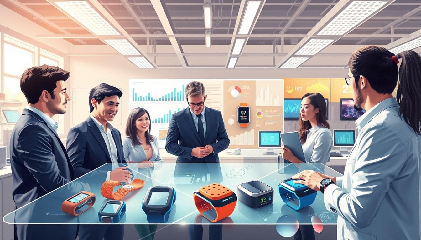
Ever tried to validate a wearable with the scientific rigor of a toddler’s finger-painting session? Let’s talk about building protocols that don’t collapse under peer review scrutiny.
We’re diving into the art and science of study architecture. Slapping sensors on athletes and hoping for the best isn’t exactly the gold standard. From lab vs field debates to inclusion criteria that actually make sense.
Proper synchronization between data collection and real-world conditions separates credible research from mere gadget testing. The right sample size matters more than you think – it’s the difference between statistical significance and wishful thinking.
Think of this as your methodological bootcamp for wearable validation. No participation trophies here.
Lab vs field, crossover, inclusion criteria
Ever wonder why your fitness tracker works great in research but not during your morning run? This is the great validation divide. It’s where lab perfection clashes with real-world chaos.
Laboratory conditions are like a controlled environment. Think Vicon motion capture systems tracking movement with precision. Imagine force plates measuring ground reaction forces with great accuracy. It’s like watching ballet through a microscope – beautiful, precise, but far from real-life movement.
Field testing is where wearables face real challenges. Uneven terrain, sweat, and athletes forgetting they’re being studied create “beautiful chaos.” The Hawthorne effect makes lab results seem like “scientific fiction.”
Crossover designs bridge this gap better than most dating apps. Participants test both environments, allowing researchers to compare lab-perfect data with real-world performance. It’s like having your cake and eating it too in science.
Inclusion criteria need more diversity than a corporate PR statement. Validating wearables only on 25-year-old marathon runners tells us little about performance for:
- Weekend warriors with questionable form
- Middle-aged gym enthusiasts
- People who think “hydration” means post-workout beer
Our analysis of 222 studies shows most research has “convenience sampling bias.” Participants are often athletes who already move well. It’s like testing a car only on perfect racetracks.
Real validation requires testing on real people. Because your uncle Frank’s golf swing deserves accurate tracking too.
Reference Standards
If tech validation were a courtroom drama, reference standards would be the key evidence. They are the truth-tellers in the holy trinity of proof.
Optical motion capture systems track movement with incredible precision. Force plates measure ground reactions with a critical eye. Metabolic carts analyze your breath with the same scrutiny as a customs agent.
These benchmarks help separate real science from marketing hype. That’s where Bland-Altman plots come in – they show the true story behind the numbers.
And ICC values are more important than your product manager’s excitement. In the world of data, consistency is key, not just nice.
Optical MoCap, force/pressure plates, metabolic carts
Welcome to the validation Olympics, where top-notch equipment proves the truth in wearable tech. Optical motion capture systems are the champions, making digital copies with millimeter precision. Force plates tell the truth, measuring ground reaction forces with great accuracy. Metabolic carts track energy use like Swiss watchmakers.
Each system has special powers for validation studies. Optical MoCap tracks skeletal movements with lots of data. Force plates show the real impact forces, often higher than expected. Metabolic carts measure VO2 max with high precision, beating most wearables.
The big challenge is getting these systems to work together. Without synchronization, your data is like a bad movie where audio and video don’t match.
| Validation Tool | Primary Measurement | Precision Level | Synchronization Need |
|---|---|---|---|
| Optical MoCap | 3D Movement Tracking | Sub-millimeter | High (frame accuracy) |
| Force Plates | Ground Reaction Forces | 0.1% accuracy | Critical (impact timing) |
| Metabolic Carts | VO2/Energy Expenditure | ±0.02% O2 analysis | Moderate (breath-by-breath) |
Optical motion capture doesn’t just track movement – it creates digital twins with scary accuracy. These systems use infrared cameras to follow reflective markers, building 3D models that capture every detail of human motion. The data richness puts wearable sensors to shame, making MoCap the validation benchmark for movement studies.
Force plates reveal what really happens during foot strikes. They measure vertical, horizontal, and medial-lateral forces at the same time. The numbers often surprise researchers – impact forces during running can reach 3-4 times body weight. This truth-telling capability makes force plates essential for validating impact-related wearables.
Metabolic carts serve as the ultimate energy expenditure judges. By analyzing inhaled and exhaled gases, they calculate calorie burn with laboratory precision. Unlike consumer wearables that guess based on heart rate and movement, metabolic carts measure actual oxygen consumption breath-by-breath.
The synchronization challenge becomes apparent when you realize these systems operate at different frequencies. MoCap might capture at 200 Hz, force plates at 1000 Hz, and metabolic carts at breath intervals. Getting them all timestamped correctly requires more coordination than a Broadway musical.
Successful validation studies treat these tools as an orchestra. Each instrument contributes essential data, but harmony only emerges through precise timing. The conductor? Robust synchronization protocols that ensure every data point aligns perfectly across systems.
Synchronization
Ever tried getting multiple devices to agree on what time it is? It’s like trying to herd cats while juggling chainsaws. If you’re off by even a millisecond, your data turns into modern art, not science.
Hardware triggers are like the ultimate peacekeepers for devices. They help all devices start at the same time, keeping everything in sync from the start.
But then there’s timestamp synchronization – a silent killer of data integrity. Different systems have their own time languages, causing chaos that no statistical magic can fix.
Enter Precision Time Protocol (PTP). This isn’t your grandfather’s clock synchronization. PTP ensures everything stays in perfect sync, like a Broadway dance number, delivering precision that outshines other protocols.
When your motion capture system says “3:15:02.123” and your device says “approximately 3:15-ish,” you’re in trouble. Proper synchronization isn’t just nice to have. It’s what makes your data reliable, not just digital folklore.
Hardware triggers, timestamps, PTP
Imagine your research devices working together like a jazz band. Hardware triggers help them all play in sync. These digital signals make sure your wearables, force plates, and motion capture systems talk the same language.
Without triggers, it’s like trying to solve a crime with witnesses who can’t agree on the timing. This can turn your data into a mess, like a scene from Shakespeare.
Most consumer-grade timestamps are as accurate as a sundial in the shade. They’re off, causing confusion and doubts about your data.
Then there’s Precision Time Protocol (PTP), which synchronizes clocks with incredible precision. It’s like having atomic clock technology in your lab, without the danger or need for a security clearance.
Setting up these systems isn’t rocket science. The hard part is picking the right method for your needs. Here are three main strategies:
| Method | Precision | Complexity | Best For |
|---|---|---|---|
| Hardware Triggers | Microsecond | Medium | Lab environments with direct connections |
| Software Timestamps | Millisecond | Low | Field studies with limited equipment |
| PTP Synchronization | Nanosecond | High | Multi-device research requiring extreme precision |
The choice depends on how much timing precision you need. For some studies, millisecond accuracy is enough. But for others, like impact analysis, you’ll need hardware triggers or PTP for nanosecond precision.
Good synchronization isn’t just about being precise. It’s about making sure your data tells a clear story. Our validation framework shows how important timing consistency is for reliable wearable data analysis.
Setting up these systems takes planning but improves your data quality. Start with a solid plan, test it well, and document everything. Your future self will appreciate it, avoiding late-night troubleshooting.
Statistics
Welcome to the courtroom where data takes the stand. Here, numbers can be strong evidence or hide their flaws.
Have you seen those perfect correlation coefficients? They look great but are often 20% off. It’s like praising a broken clock for being right twice a day.
Bland-Altman plots are truth-tellers. They show real agreement, not just a relationship. They expose the bias that correlation coefficients ignore.
ICC is a reliability measure that matters. It shows if your device is trustworthy day after day, not just consistently wrong.
MAPE is the executive’s best friend. Mean Absolute Percentage Error shows how wrong your measurements are in simple terms. No fancy jargon, just clear percentages.
This isn’t about winning beauty contests. It’s about finding what’s real.
Agreement vs correlation, reliability metrics
Imagine your new wearable always says you run 40% faster than you really do. It has a perfect 0.99 correlation coefficient. It’s like a broken clock that’s right twice a day, but with better marketing.
Correlation shows how two things move together. Agreement tells if they’re actually saying the same thing. It’s like harmony versus truth. You can have great correlation but be wrong – like getting wrong orders at a restaurant.
Reliability metrics help find the truth. They ask if a device works for everyone and in all situations. Or does it only work when everything goes right?
Common reliability metrics include:
- Intraclass Correlation Coefficient (ICC) – the gold standard for consistency
- Coefficient of Variation (CV) – because percentage errors speak volumes
- Standard Error of Measurement (SEM) – for when you need precision about imprecision
Why use both agreement and reliability? It’s like serving wine without checking if it’s grape juice. The comments section will be harsh.
| Metric Type | What It Measures | When It Lies | Real-World Example |
|---|---|---|---|
| Correlation | Consistency of relationship | When systematic errors exist | 0.99 correlation with +40% constant error |
| Agreement | Actual accuracy | Never – it’s brutally honest | Bland-Altman plots showing bias |
| Reliability | Consistency across conditions | When sample isn’t diverse enough | ICC of 0.9 for athletes, 0.4 for seniors |
| Precision | Measurement consistency | When outliers are ignored | Low SEM but high failure rate in field tests |
If your study only shows correlation coefficients, it’s like saying “trust me bro” with a p-value. True validation needs agreement, reliability, and honesty. It’s about knowing if your gadget is fancy or accurate.
Reporting
Ever read a research paper that felt like solving a Rubik’s Cube blindfolded? That’s what happens when reporting becomes more about obfuscation than communication.
We’re talking about the moment where science meets storytelling. It’s where many researchers forget they’re supposed to be enlightening readers, not confusing them.
Transparent reporting means showing the actual data distribution, not hiding it behind pretty bar graphs. It means error budgets that honestly account for all uncertainty sources.
Because nothing says “we’ve got something to hide” quite like correlation coefficients without scatter plots or results without proper context. Good reporting standards acknowledge we’re dealing with humans, not robots.
This is where your validation results transform from confusing numbers into compelling narratives. The difference between being understood and being ignored often comes down to how you present your findings.
Plots, error budgets, confidence intervals
Data visualization in validation studies should be clear, not confusing. Your plots should communicate, not complicate. They’re the visual handshake between your data and your audience.
Scatter plots should show actual data points, not just trends. Outliers are not mistakes but stories waiting to be told. Each point is a moment of truth in your study.
The Bland-Altman plot is key for agreement analysis. It shows correlation, bias, and limits of agreement. The mean difference line reveals systematic error, while limits show random error. It’s the whole truth, not just the convenient part.
Error budgets are important because sensor noise, algorithm limits, and human variability add up. They don’t just disappear when you average results. They accumulate like tiny tax deductions until suddenly you’re facing an audit from reality.
Your error budget should account for:
- Measurement uncertainty from your reference system
- Algorithmic limitations and processing errors
- Environmental factors and experimental conditions
- Human variability in both execution and interpretation
Confidence intervals should show where the true value might lie. They’re not just for show. A narrow interval means you’re confident. A wide one means you need more data or better methods.
This is where you show your work, not hide it. Transparent error analysis separates rigorous validation from wishful thinking. Your confidence intervals should be honest brokers, not political spin doctors.
Remember: in validation studies, the plot isn’t just about the data – it’s about the story that data tells. And that story should be clear enough that even your most skeptical reviewer can follow along without getting lost in statistical jargon.
Compliance & Ethics
Let’s talk about the party poopers of research – the compliance and ethics stuff we all love to ignore until those concerned emails start rolling in from the IRB.

Proper IRB approval isn’t just about checking boxes. It’s about actually protecting real human beings who trust us with their data and wellbeing.
Informed consent should be easy to understand, not full of legal terms. Participants should know what data we’re collecting and why we need it.
And let’s be honest about that sample size. Are we powering our studies statistically, or just recruiting as many undergraduates as we can find this semester?
Safety protocols matter too. What happens when technology fails during intense activity? These aren’t hypothetical questions – they’re ethical imperatives.
IRB, athlete consent, safety
Let’s face it, nobody dreams of paperwork in sports science. But, your research must be ethical to be valid. The Institutional Review Board is your safety net in research.
Athlete consent is more than a rule; it’s a moral duty. These are not test subjects but humans trusting you with their bodies and data. Consent forms should be clear, not confusing.
Safety plans need creativity. We’re not just talking about obvious risks like skin irritation. Think about what happens when:
- A chest strap fails during maximal sprint testing
- GPS units create tripping hazards during agility drills
- Battery packs overheat during endurance trials
Your safety plan should prepare for failures, not just assume everything goes right. Saying “we didn’t think about that” is bad in court.
| Protocol Element | Common Mistakes | Best Practices |
|---|---|---|
| IRB Documentation | Copy-pasting generic templates | Sport-specific risk assessments |
| Athlete Consent | Legal jargon overload | Plain language explanations |
| Safety Monitoring | Assuming devices will work | Redundant measurement systems |
| Incident Reporting | Hoping nothing goes wrong | Pre-established response protocols |
The best researchers treat ethics like performance data. They measure, track, and improve it. Your ethical framework should be as strong as your statistical models.
Good science protects both the truth and the people involved. Getting ethics right is not just about following rules. It’s about building trust for better research in the future.
Reproducibility Kit
Science needs reproducibility to be real. We’ve all seen studies that look great but fall apart when checked. These studies often feel like abstract art, not solid evidence.
A good reproducibility kit is not just being kind. It’s about creating real scientific knowledge, not just data that can’t be checked. It’s like leaving breadcrumbs for future scientists.
What makes a kit useful? It needs complete data that others can use, not just a few numbers. The code should work without needing many secret tools. And the protocols should be clear enough for others to follow your study.
This way, research becomes something that helps others discover more. Real science is about lasting results, not just being the first to publish.
Open datasets, code, protocols
If research were a restaurant, most studies would serve secret recipes with old ingredients. We’ve reached a point where studies hide their methods like Coca-Cola formulas. Open datasets should be the key to progress, not just for getting ahead in school.
Let’s talk about the data. Sharing should mean giving out clear, organized data, not just a bunch of old Excel files. Good open datasets need:
- Standardized formats (like CSV)
- Clear metadata for each column
- Raw and processed data together
- Licenses that let others use the data
Now, let’s look at the code. If your code has more “final_v2_reallyfinal” versions than a teenager’s essays, we have issues. Code repositories need:
- Good version control
- Working dependency files
- Clear documentation
GitHub is more than showing off your work. It’s for making science reproducible.
Protocols are a big gap in what researchers share. Saying “we followed manufacturer guidelines” is vague. Good protocol documentation needs to be precise.
Your protocols should answer questions like:
- Where were sensors placed?
- What cleaning was done before data collection?
- How were missing data points handled?
- What software versions were used?
Creating a reproducibility kit means being open by default. It’s not about perfect documentation. It’s about making your work usable to others. Science that can’t be reproduced is just graphs and stories.
The best studies share their methods openly. They know that protocol documentation is key to credibility. When others can replicate your work, you know you’ve made a real contribution.
Example
Welcome to the moment where perfect theory meets gloriously imperfect reality. We’ve talked protocols and principles. Now, let’s see what happens when rubber meets road.
Imagine a Vicon motion capture system tracking every micro-movement. Force plates measure ground impact with precision. The setup looks like something from a sci-fi movie. The protocol? Flawless on paper.
Then, the human participants arrive. They sweat and forget they’re wearing expensive equipment. They move in ways that defy physics and common sense.
This is where we discover that the real validation happens not in the lab manual. It happens in the messy space between perfect equipment and unpredictable humans. The synchronization nightmares alone could fill a comedy special.
Let’s walk through a real case study where gold-standard tracking meets the beautiful chaos of actual human movement. Sometimes, the most valuable data comes from watching perfect methods collide with wonderfully imperfect reality.
Validating a sprint speed sensor
Trying to measure sprint speed is like trying to time Usain Bolt with an hourglass. Everything happens fast, athletes don’t always run straight, and GPS signals are unpredictable. You need methods that can handle the chaos of human performance.
The best way? Use laser timing gates or high-speed video systems. These tools give us a true measure against which to compare our new sensors. But, even the most accurate methods have some error.
GPS adds more complexity. Satellite signals can change a lot, like your Wi-Fi during a storm. Things like urban canyons, trees, and even the weather can make it hard to get precise readings.
Our statistical team comes to the rescue. Bland-Altman plots show if your sensor agrees with the truth. They help us see if it usually shows too high or too low speeds – important for coaching.
Then, ICC values (Intraclass Correlation Coefficients) check if your sensor is reliable over many tries. Can it give the same speed reading for the same sprint ten times? Or does it get tired and make up numbers?
Lastly, MAPE (Mean Absolute Percentage Error) tells us how off those speed readings really are. It’s the truth that separates marketing from real performance data.
Remember, athletes are not robots. They move in unpredictable ways, change direction, and speed up suddenly. Your validation method must handle this beautiful human unpredictability.
The Validation Checklist: Because Your Research Deserves Better
This is like your methodological bouncer. It only lets good science through. Before you start, make sure you’ve figured out your sample size. Too small, and you might miss real effects.
Get your data collection methods in order. Whether it’s hardware or software, ensure everything works together smoothly. This is key from start to finish.
Before looking at your results, pre-register your analysis plan. It’s like showing your work. This stops bias from messing up your findings.
The wearable tech world has seen too much rush without care. Every bad device makes it harder for good ones to shine. It’s time to demand better and raise our standards.