
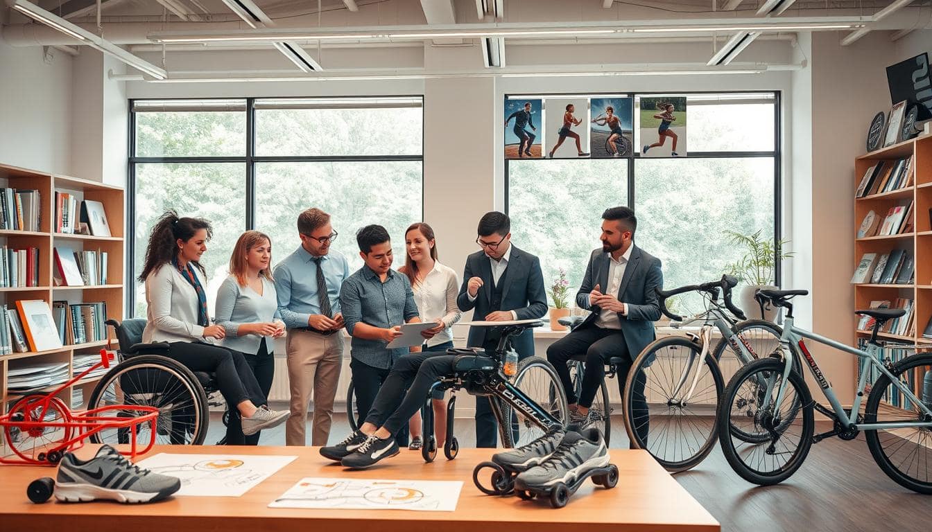
Most athletic gear seems made for Olympic athletes, not real people with different bodies and abilities. We’ve grown used to this, but why should good design be a special treat?
Universal design is changing the game. It’s not just adding a rubber grip to a bat. That’s just accessible design, a quick fix.
Real change comes from asking different questions. Instead of “How do we modify this for them?”, we ask “How do we build something awesome for everyone?” Ron Mace’s work shows us the way.
His seven principles guide us to create products that are fair, flexible, and easy to use from the start. It’s about designing for everyone, not just the average.
This new way of thinking about accessibility standards is key. It’s not just a checklist anymore. It’s the base of inclusive innovation. Let’s see why this shift is essential.
Age-Related Considerations in Equipment Design
Forget ‘senior’ and ‘junior’ sections—true inclusive design sees age as a fluid continuum of needs and abilities. We’re not designing for birth years. We’re designing for the five-year-old with boundless energy and the seventy-year-old with strategic wisdom. Their equipment shouldn’t box them in.
This is where universal design becomes our playbook. It’s not about creating separate, stigmatized lines. It’s about engineering products that adapt. The goal? Authentic barrier-free sports where the only opponent is across the net, not in your hand.
Let’s get tactical. Two principles from the universal design framework are key here. Principle Six demands Low Physical Effort. Think about fatigue. Why should holding a tennis racket feel like a forearm workout before the first serve?
Then there’s Principle Seven: Size and Space for Approach and Use. This isn’t just about making something bigger or smaller. It’s about accommodating how a body moves—whether it’s a child’s developing coordination or an older adult’s mindful posture.
The magic happens in the details. Adjustable resistance on a stationary bike lets a teen athlete and their grandparent share the same machine. Ergonomic grips with textured, forgiving materials don’t require a vise-like clutch. Equipment weight is redistributed to minimize strain, not maximize it.
Consider this shift in philosophy. Are we asking users to adapt to our design, or is our design adapting to them?
| Design Aspect | Traditional, Age-Segmented Approach | Universal, Age-Inclusive Design |
|---|---|---|
| Resistance & Weight | Fixed settings; “heavy duty” vs. “lightweight” models. | Adjustable dials and modular components for fine-tuned control. |
| Grips & Handles | One standard diameter; often hard plastic. | Contoured, compressible materials in multiple size options. |
| Size Adjustability | Separate SKUs for “Youth,” “Adult,” “Senior.” | Integrated telescoping poles, lengthening straps, and expandable frames. |
| Cognitive Load | Complex assembly; tiny, confusing buttons. | Intuitive, tactile controls with clear visual and haptic feedback. |
| Primary Goal | Segment the market for maximum sales. | Create a seamless, barrier-free sports experience for a lifespan. |
The result? A child isn’t intimidated by gear that’s too big. A masters athlete isn’t sidelined by gear that’s too punishing. This isn’t charity. It’s smart engineering that recognizes human variance.
When we embrace this fluid universal design mindset, we stop seeing age as a limitation to design for. We start seeing it as a spectrum of opportunity to design with. The play should be the challenge, never the equipment.
That’s the real win. Not just a product that sells, but a philosophy that includes. It turns every court, field, and gym into a more accessible space. That’s how we build truly barrier-free sports for everyone.
Gender Inclusivity in Sports Product Development
Gender inclusivity in sports gear is more than just looks. It’s about changing how equipment fits different body types. For years, the industry just made men’s gear smaller and pinker for women. This approach is like serving a fancy meal on a kid’s plate—it’s not just wrong, it’s insulting.
Real inclusivity starts with understanding that bodies are not just smaller versions of each other. Women and men have different body shapes and sizes. A harness made for men can be too tight or not secure for women. A bike frame made for men can make women ride in an awkward way. It’s not about treating everyone differently; it’s about making sure everyone can use the same accessibility standards.
The first rule of universal design is Equitable Use. It aims to make sure everyone can use the product without feeling left out. Think about a basketball program. Using only a standard ball can leave out younger or weaker players. Including different sizes, like a smaller women’s ball and a foam ball, lets everyone play their best.
This idea of choice is at the heart of sports inclusion. It’s not just for men and women anymore. It’s for everyone, including those who don’t fit into traditional sizes. It’s about making sure everyone feels supported and powerful, not like an afterthought.
To make this work, we need facts, not guesses. Studying how women’s bodies are different is key. Resources like the National Center for Biotechnology Information show how these differences affect sports. Designing with this knowledge makes gear that really fits, meeting higher accessibility standards for all.
So, what does this look like in practice? The table below shows the shift from old, gendered designs to new, inclusive ones.
| Design Aspect | Traditional “Gendered” Approach | Inclusive, Equitable Approach | Impact on Athlete Experience |
|---|---|---|---|
| Product Sizing | Men’s sizes scaled down for “Women’s” line. | Sizing based on anthropometric data from diverse body types across the gender spectrum. | Better fit, improved comfort, reduced risk of chafing or injury from ill-fitting gear. |
| Color & Aesthetics | Pink, purple, or pastel “feminine” colors vs. dark, “masculine” colors. | Neutral color palettes and designs focused on performance, with personalization options. | Athletes choose gear based on preference, not prescribed gender norms, fostering a sense of identity. |
| Biomechanical Support | One support structure assumed for all body types (e.g., uniform chest compression in sports bras). | Targeted support zones designed for different ribcage shapes, breast tissue distribution, and pelvic alignment. | Enhanced performance stability and confidence, allowing athletes to focus on movement, not adjustment. |
| Marketing & Messaging | Segregated campaigns showing women in passive or “graceful” poses vs. men in powerful action shots. | Campaigns showing athleticism and skill across all genders, using diverse role models. | Creates a welcoming environment, encouraging participation and reinforcing that sport is for every body. |
The goal is for the equipment to fade into the background. When a bike fits perfectly, riders focus on the trail, not the bike. When a shoe fits right, runners focus on their speed, not their feet. That’s what gender-inclusive design offers. It’s not just for a few; it’s the key to true sports inclusion, where only talent matters.
Economic Accessibility and Tiered Product Lines
Price tags often block access to sports gear. We see high-tech prosthetics that help athletes, but they’re too expensive. This issue is not just about money; it’s about fairness.
Imagine a world where everyone can play sports, not just those who can afford it. A tiered product line could make sports gear more affordable. This way, more people can enjoy sports.
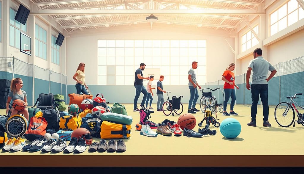
Think of sports tech like Tesla’s cars. They started with high-end models to fund research. Then, they made more affordable versions for everyone.
Universal design makes sports gear better for everyone. Simple designs are easier to make and use. This helps more people play sports.
When sports gear is affordable, more people can join. This isn’t just charity. It’s a smart business move that grows the market.
Let’s compare how to make sports gear:
| Traditional Model | Tiered, Inclusive Model | Market Impact |
|---|---|---|
| Single high-price-point flagship product | Scalable technology platform with multiple price tiers | Limited to affluent consumers vs. access across economic strata |
| R&D costs amortized only across luxury units | R&D amortized across entire product ecosystem | Higher per-unit cost vs. lower per-unit cost through volume |
| Marketing focused on elite performance | Marketing focused on universal participation | Niche audience vs. mass-market community building |
We don’t want everything to be cheap. We want excellence to be within reach. Youth sports should be safe and affordable for everyone.
Sports inclusion is about making sports for everyone. It’s not just about the gear. It’s about making sports accessible to all.
The most important thing in barrier-free sports is a price that welcomes everyone. It’s about making sports for everyone, not just the few who can afford it.
Language and Cultural Barriers in Sports Tech
Imagine a smartwatch that speaks English to someone who only speaks Mandarin. It’s not just noise; it’s a barrier. We focus on physical performance but forget about understanding the tool.
Universal design is key here. It’s not about making things simple. It’s about making them accessible to everyone. We aim for an interface so clear, you don’t need a manual.
The fourth principle of universal design is about clear information. It should be shown in pictures, words, and touch. This is because true accessibility standards focus on understanding and communication, not just physical ability.
A coaching app that only uses text is a barrier. A rowing machine with too much jargon is useless to many. We need to communicate in many ways.
Pictograms and intuitive icons are key to global usability. Think of airport symbols. You don’t need to read to find baggage claim or a restroom. Our sports gear should be just as easy to use.
Voice guidance in many languages helps everyone. Haptic feedback, like different vibrations for alerts, creates a language of touch. This way, the message gets through, no matter the language or reading level.
It’s not just about translating. It’s about making content relevant worldwide. A workout named “American Football Drills” might not work globally. But “High-Intensity Agility Training” with universal animations does. We must design for the global game, where clarity is the ultimate currency.
When we commit to universal design, we stop making useless gadgets. We start making tools that empower everyone, everywhere. That’s the real victory—and it’s one that crosses every language barrier.
Physical Space Accessibility for Equipment Use
The best sports equipment is useless if you can’t reach it. We focus on grip, weight, and feedback. But we often forget about the space around it.
Enter Universal Design Principle Seven: Size and Space for Approach and Use. This isn’t just a suggestion. It’s about designing for the human and their devices to use the product easily.
Think of it as choreography. A wheelchair user needs a 60-inch circle for turning. A walker user needs a 36-inch wide path. A coach needs space to stand without tripping.
This principle has three key demands:
- Clear Line of Sight: Can a seated athlete see the controls? Can a child see over the equipment?
- Comfortable Reach: Are controls within 15 to 48 inches from the floor?
- Space for Assistive Devices: Is there room for a wheelchair next to a weight bench?
When these elements work together, the space becomes a help, not a hindrance. True sports inclusion is achieved. The dream of a perfect home gym becomes real for everyone.
Let’s make it real. How does this principle turn into a blueprint? The table below shows the difference between a standard setup and one designed for barrier-free sports. It’s not just a spec sheet; it’s a call for justice in recreation.
| Spatial Feature | Standard / Non-Inclusive Practice | Inclusive / Principle Seven Design | Impact on User |
|---|---|---|---|
| Approach Zone | Frontal approach only; may be blocked by other equipment. | Clear floor space for parallel (side) approach by wheelchair (min 30″ x 48″). | Enables independent, safe access without complex maneuvering. |
| Turning Radius | Assumed able-bodied pivot; tight corners. | Provides 60″ diameter circle or T-turn space for wheelchair turnaround. | Preserves user energy for the activity, not the navigation. |
| Knee & Toe Clearance | Solid cabinets or supports under benches/consoles. | Minimum 27″ high, 30″ wide, 19″ deep clearance under elements for seated users. | Allows a wheelchair user to get close enough to actually use the equipment. |
| Sightlines to Controls | Displays mounted high for standing viewers. | Critical information and controls placed within a 15″-48″ vertical field from floor. | Ensures usability for seated users, children, and people of shorter stature. |
This isn’t just about following rules. It’s about changing how we see the journey to use the product. That journey starts at the parking lot and ends with using the gear confidently. When we design the space as carefully as the objects in it, we invite everyone to participate. The right to play is real when we have the right to the space to play in.
Technology Literacy and Digital Inclusion
The irony of ‘smart’ sports gear is that it often makes users feel dumb. It creates a new kind of barrier we never saw coming. Now, your jump rope critiques your form, and your tennis racket judges your backhand.
But for those who didn’t grow up with screens, this digital layer feels like exclusion. It’s not innovation; it’s a barrier to entry.
Digital inclusion is the next big thing in universal design. It’s not just about physical equipment. The digital interface must be accessible too. A gym that’s wheelchair-friendly but has app-controlled machines only millennials can use isn’t truly accessible.

WCAG 2.1 is key here. It’s a guide for designers to make digital interfaces for everyone. Features like voice command and high-contrast displays make tech usable for all.
Tools like Axe and WAVE are essential for quality control. They catch what designers might miss. These tools ensure digital interfaces meet accessibility standards.
Using multiple learning resources is the real magic. Why limit learning to one method? Offer augmented reality tutorials, audio-guided sessions, and captioned videos. This approach is true universal design.
Consider a connected rowing machine that offers VR scenery and audio cues. Or a smart basketball that provides haptic feedback and visual analytics. The technology adapts to the user, not the other way around.
Digital inclusion needs “intuitive generosity.” Interfaces should anticipate confusion and offer help. Use clear language and progressive disclosure of features. Design for both novices and experts.
The most inclusive digital experiences are invisible. They don’t show off their sophistication; they just work. Voice commands and gesture controls that mimic real-world movements are key.
In our quest for tech innovation, we must remember: leaving people behind is failure. True innovation meets users where they are and guides them forward without judgment.
The future of sports technology is about including everyone. It’s not about being smarter than the user. That’s the real victory in this digital game we’re all playing.
Community Engagement in Inclusive Design
The “nothing about us without us” principle is more than a slogan. It’s the key to true sports inclusion. Often, designs are made without real input from the community. This leads to missing the mark.
Creating barrier-free sports equipment is a team effort. It involves people from all walks of life. Their experiences are invaluable.
Working together is messy but necessary. Tools like Miro and Slack help everyone’s voice be heard. This way, the community is a true partner, not just a subject.
The outcome is a product that truly works. A wheelchair basketball attachment made with athlete input doesn’t just meet standards. It feels right and performs well. It becomes a part of the game.
| Stakeholder Role | Primary Value in Co-Design | Common Insight Provided | Tool for Effective Collaboration |
|---|---|---|---|
| Adaptive Athlete | Lived experience, real-world performance feedback | “The grip fails when my hands are sweaty.” or “This weight distribution throws off my balance during a pivot.” | Shared prototyping files (Figma, CAD), in-field testing sessions |
| Community Coach | Practical logistics, group dynamics, adoption barriers | “My athletes won’t use something that takes 10 minutes to set up.” or “This color scheme is stigmatizing for teens.” | Slack channels for quick Q&A, survey tools for group feedback |
| Physiotherapist/Occupational Therapist | Biomechanical safety, ergonomic optimization, injury prevention | “This angle creates repetitive stress on the joint.” or “The material here needs to accommodate swelling.” | Miro boards for annotating designs, shared research folders |
| Inclusive Sports Program Manager | Scalability, cost-per-user, storage & maintenance realities | “We need one size to fit most, or our budget collapses.” or “How does this survive being cleaned daily?” | Budget modeling spreadsheets, lifecycle cost analysis documents |
Creating this table is about bringing together different perspectives. When everyone’s voice is heard from the start, you solve real problems. This is the heart of creating true sports inclusion. The result is a product that truly empowers, made by the community it serves.
Measuring Inclusion Success Metrics
Tracking inclusion metrics is like trying to measure empathy. It’s challenging but essential. We live in a world that loves data—every detail is tracked and analyzed. But what about the data that shows who’s really benefiting from our products?
Good intentions are just the start. Without numbers, inclusive design is just a theory. We need to prove it with data, just like we do in sports.
So, what are we measuring? We look at several important areas. User satisfaction scores show if we’re meeting our goals. Are wheelchair basketball players as happy with the grip as elite athletes? Engagement rates tell us who’s using the product and for how long.
Then, there are safety and how well the product works. Has the new design lowered injury rates for seniors? Does the adaptive interface help new users learn better? This makes inclusion real.
We need the right tools to gather this data. Platforms like Zigpoll and SurveyMonkey help us ask the right questions. But it’s not just about sending surveys. It’s about using feedback to improve our products.
The magic happens when we combine all this data. A dashboard turns numbers into a clear story. We track how well our products meet accessibility standards. We also make sure we’re designing for everyone, not just a few.
Let’s compare some key inclusion metrics. It’s the difference between guessing and knowing.
| Metric Category | What It Measures | Tool for Collection | Benchmark for Success |
|---|---|---|---|
| User Satisfaction | Perceived value & comfort across user groups | Post-use surveys (Zigpoll) | ≤5% variance between demographic segments |
| Safety Performance | Injury rate correlation with design changes | Medical reports & usage logs | Reduction in repetitive stress injuries |
| Engagement Equity | Usage duration & frequency by demographic | Product analytics dashboards | Consistent engagement across all user types |
| Learning Curve | Time to proficiency for new users | Onboarding analytics & tests | Similar proficiency timelines regardless of ability |
| Market Representation | Demographic diversity of actual users | Registration & profile data | User base mirrors general population diversity |
This table is more than just a spreadsheet. It’s a way to hold ourselves accountable. When data shows a problem, we know exactly what to fix. No more guessing.
The goal is to make these metrics part of our design process. Regular reports keep universal design real, not just an idea. It becomes a goal, like any other.
What gets measured gets better. In inclusion, that means real change, not just gestures. The dashboard tells us where we’re doing well and where we need to improve. That’s how we turn good intentions into great products.
Policy and Regulation Impact on Design
Let’s talk about the rulebook. The Americans with Disabilities Act and the Building Code of Australia are here to stay. They set the standard for accessible design. They ensure everyone is treated fairly.
Seeing these laws as the end goal is a mistake. It’s like celebrating for not breaking rules. True innovation in sports inclusion starts with these policies, not ends with them.
The ADA is the minimum. Your goal should be to exceed it. When you create products that go beyond code, you’re not just following rules. You’re setting new standards for everyone. This makes barrier-free sports the norm, not a special case.
Think about it. The most iconic products in history didn’t just meet regulations. They made those regulations look old-fashioned. They raised the bar. This is your chance to do the same for sports inclusion.
Going beyond compliance is not charity. It’s a competitive edge. It builds loyalty that no ad can buy. People remember who let them play, even when others said no.
So, don’t just build to code. Build to inspire. Make future policymakers look at your work and say, “We need to catch up.” That’s the real legacy of inclusive design.